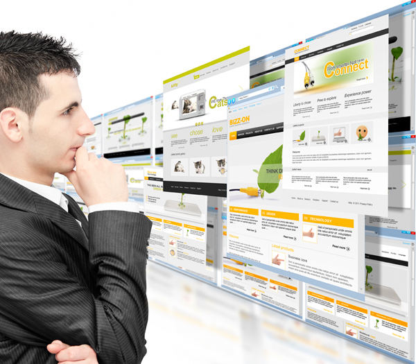
If you want to attract visitors to your website you should take care to provide quality content, always accompanied by a nice design for users and delivering together a website with high usability.
Usability is a quality attribute that assesses how easy they are to use user interfaces. The word usability also relates to the methods used to improve the ease of use during the design process. In other words, it is to make a simple website that is user friendly and is easy to use.
Create Active Navigation
It is helpful that you know what section or category is sailing. The ideal way to create a state of active navigation situation, apart from the server. This will save a massive amount of HTML and CSS required. If this is not a viable option for you, you can manipulate your body members to directly give a style to each navigation item. A third option is to do it directly with JavaScript.
Clickable Buttons and Labels
This is a great tool for usability and is directly embedded in HTML. Unfortunately, very few users are familiar with this wonder. It only takes one or two lines of CSS to let the user know that something is clickable.
Link your Logo
Link your logo on the home page is one of the most frustrating situations when navigating a website. It is very easy to do and will save time (valuable seconds) for the user.
It is very common today users do not directly use the “Home”, but the logo button to access the main page. Such as Facebook; added the parameter “ref” to each of its elements of navigation and clicking their logo, you agree to start direct.
Increase the Area of a Link
This tiny detail can make a big difference. Add padding around the area of the link, thus increasing the area in which you can actually click on it. This is also very useful in the mobile versions of your site, as our fingers are much larger than a mouse cursor and really need that extra space.
Focus on the Fields
Apply approach to the fields of writing is a growing trend within the UI designs. Allows user to know that the action that they develop, will trigger another. It is a quick and easy way to show the user that your site detects that he is there.
Provides a Useful 404 Page
Make the user feel comfortable is very important and should be your priority. Throwing a huge error message is not the best way to achieve this, in case something goes wrong. Nor why you post the error code numbers; that does not serve anyone but developers. Design a useful 404 page with an explanation of why you cannot access your website or an apology, provides an alternate browser or suggest other destinations.
Use Language to Create a Casual Atmosphere
Write on the web is an important issue today. There is a list of things to consider; HTML, CSS, progressive improvements, accessibility, usability, web standards, etc.
However, all that must converge on a casual writing style … as if we were talking to our friends. Give them a sense of relaxation, comfort and informality, in the tone you want in your style.
Apply Line Height to Improve Readability
This point was inherited from the physical media, such as books or newspapers. Be a small spacing improves readability, but beware; this aspect, within the web design can be very easily abused.
Use the Blank
Group items are one of the easiest ways to show association. You can do this with images, borders or white space. Use well the latter, as in items with enumerations or Top 10, you tend to waste a lot.
Be Accessible
In the case of a website, accessibility refers to being there for users when they have a problem; ten responsiveness. Someone entering your website and confused, without help, can be tragic. That time you let abandoned to their fate can make the difference between going and not return to your site.


