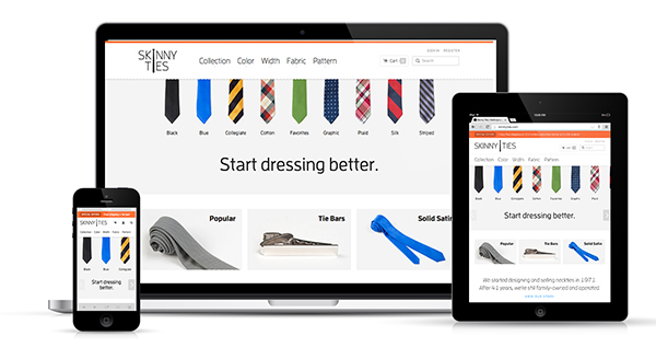
Online sales are rising year and year, and increasingly it is the mobile web which is the point of purchase. The app and mobile site of your online storefront definitely needs to provide users a compelling experience. Here’s how you can make this possible for your site.
Seamless Transition Between Desktop and Mobile Site
It is almost an unwritten rule – a user must be able to get off his desktop and continue his transaction or browsing from his tablet or cellphone. In fact, that is increasingly going to happen as people become dependent on their devices to browse online content. They should easily be able to find the same deals, access their wishlist and easily buy products. Additionally, the design strategy must feel consistent between both platforms.
The Target Audience
Before planning a mobile ecommerce website, you need to keep in mind the target audience. You need to devise the mobile strategy for this audience, which includes the price promotions, discounts etc. For example, college kids might be more price conscious, and you need to show off the price savings you provide them. A price sensitive audience also will be excited by regular online sales. For a 25-30 year old professional crowd, you need to use a discount strategy that pushes them to shop after hours or on the weekends.
On the other hand, “social shoppers”, people who love following brands, influential personalities and the latest trends would want a very visual experience. The world’s biggest e-commerce sites devise regular campaigns and use mobile functionality (e.g. app notifications) to keep users constantly tuned into.
How you Allow Users to Navigate the App/mobile Site
Along with an easy to use search box, you also can opt for off-canvas navigation that pops in with the push of a button. Since it is becoming an industry standard, you won’t need to worry about users not knowing how to navigate it. You need a specialist e-commerce website designer like Think Big Online to ensure navigation is absolutely flawless.
Photography
Product photography is critical to how a buyer perceives not only the product, but the site as a whole. With captivating photography, a buyer can be compelled to make a purchase. For example, when selling a product with multiple components (e.g. a home theater system), also feature shots of individual parts and accessories. Using a 360° shot, you can let the user virtually rotate the product through 360° of rotation and see what it looks like from various angles. At the time, the images should be optimized so the pages load fast.
Typography
It should be easy to read your site. Users shouldn’t have to zoom in and out to read all the text mentioned. The typography – which includes the font, colors, and typeface, should be readable, responsive and well-spaced.
Finger Friendly
You must consider that your user is probably accessing your site on the go. A user should be able to easily skim through your site’s inventory and comfortably click on buttons like ‘“Add to cart” and “Pay now securely”.For your first mobile web design stint, it is better to consult with industry veterans at http://www.thinkbigonline.com/mobile-website-design-4/.


