Web fonts and typography have come a long way since the early days. There are now more choices than ever before, with designers constantly creating new web fonts to pick from.
When a designer chooses which font to use for their web design, they must consider a variety of design elements and how they work together.
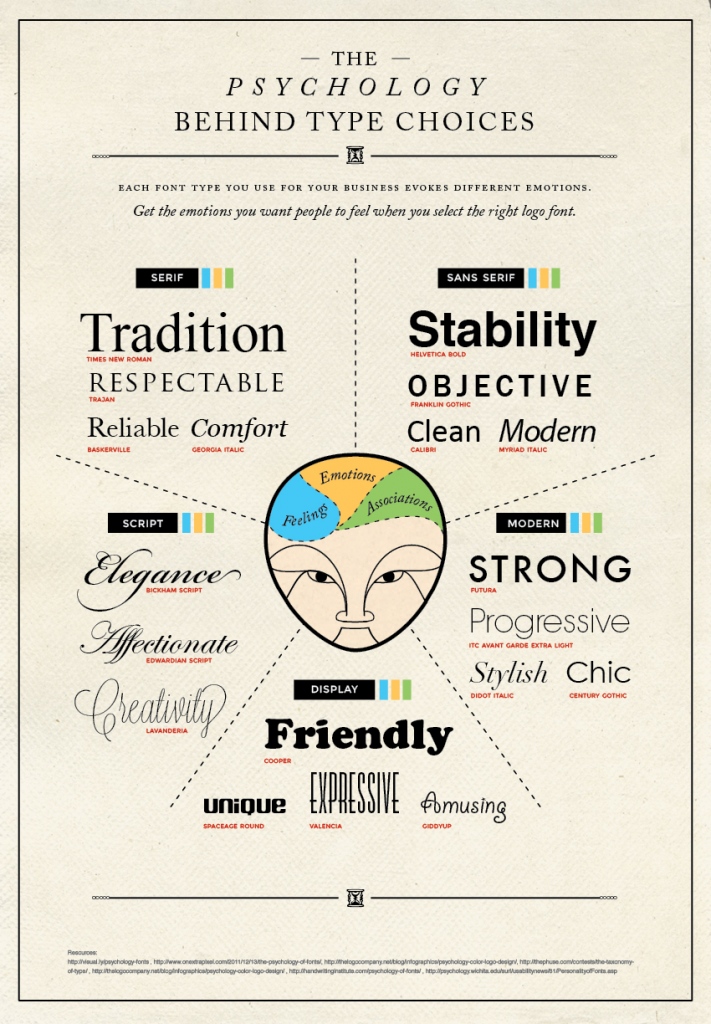
What does the font say about you?
Even if you’re not a designer, you will notice that certain fonts have an inherent psychology associated with them. For example, you would never use a pretty script font for a bank logo or an urban font to advertise a medieval fair.
It’s important that you match the mood of typeface to that of the project. Whether it’s old fashioned, modern, fun, casual or serious, there’s a font for it. You just need to take the time to find the font that delivers the right message.
Don’t be afraid to break a few rules
While readability is important when it comes to selecting your font and typography, you shouldn’t be afraid to break a few rules and get a little creative. Playing around with different typographies can really help you to create a web design that stands out from the crowds.
The trick is to keep the body text readable. You don’t want to put users off by going overboard with your typography in the bits that really matter to them. If you want to get funky with typography, go for headers, navigation and other parts of your site.
That being said, you don’t have to go overboard just because you can. While there are thousands of web fonts available to you at the click of a button, sometimes web-safe fonts are what works best for the reader. In the end, it’s the readers you need to impress, not other designers.

Don’t forget to test it first
You may think you have found the perfect web font for your project, but it’s important that you see it in action first. That means testing their appearance across various different browsers and platforms.
While this may seem obvious, it’s an easy thing to overlook if you are conducting your web design from one device. You don’t want to get carried away with the process before testing it out across various different platforms. While your design may look great on your Mac, it may look quite a bit different when viewed on Windows.
Find the right balance
It can be tempting to try and give your web design a unique style by focusing on the aesthetics. However, while typography can be a big part of brand recognition, you don’t want to forget about the end user.
If the content takes too long to load, then users can end up feeling frustrated and might just abandon the page altogether. Not just that, but designs can render differently across browsers and might not end up looking the way you would have wanted it to.
In the end, it’s all about finding the right balance between aesthetics and performance. Every choice you make as a designer should have a clear and defined purpose, and stay in line with your end goal.


